Update: As of Xamarin.Forms 1.5.1 Material Design AppCompat is included! See the official blog to convert your app: https://blog.xamarin.com/material-design-for-your-xamarin-forms-android-apps/
I am an extremely big fan of Material Design for Android applications. Case and point is this tweet that I sent out last night:
I wish the entire world was themed with Material Design.
— James Montemagno (@JamesMontemagno) April 4, 2015Over the past six months have I present on Material Design at Xamarin Evolve and also at user groups and the number one question I get is: “How can we use Material Design in Xamarin.Forms?”
That is a loaded question because Material Design is not only the core theming of the application, but it is custom controls, animations, transitions, and a plethora of other things. Check out Google’s Material Design guidelines for everything that is really part of material design.

When it comes to Xamarin.Forms and Material Design it is a tricky question. All the custom control, animations, transitions, and jazz like that you most likely will not be able to do with out some work and some renderers. However, you still have the ability to add in a little Material Design Theming and of course you can follow proper spacing and guidelines on the 4dp grid.
The AppCompat Debate
Revision 21 of AppCompat v7 was pretty ground breaking. Traditionally, AppCompat brought the use of the ActionBar to older platforms, but Revision 21 changed all of this by bringing Material Design Themes and controls to older devices. This is important since Lollipop is currently 3.5% of the market! Currently, Xamarin.Forms does not use AppCompat which means we can not take advantage of the new compat theming, but there is NO reason that we can’t make our Lollipop users happy by adding a little material theming to their app. This will bring not only material design themes, but also all the fancy touch events, and other core Lollipop control features from the core OS, which will be very nice.
Base Styles:
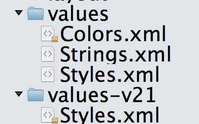
The first step is to ensure that you have you Resources/values/styles.xml and base theme setup to use Holo. In your Android project under Resources/values simply create a new xml file and name it styles.xml. Then you can place this XML in it:
Next is to create our Lollipop specific styles under Resources/values-v21/styles.xml, which you will place:

I like to put all of my color resources in Resources/values/colors.xml, and this is what mine looks like, which you can see I am referencing in the values-v21/styles.xml:
Update ApplicationManifest.xml
You must now of course tell your Android app to use this new fancy theme that you have created by setting the android:theme attribute:
Remove App Icon from ActionBar
The new default in Lollipop is to hide the app icon from the main action bar and you can easily do this inside of your MainActivity.cs with just a few lines of code:
Update Hamburger Button (optional)
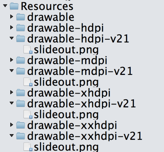
If you are using the MasterDetailPage you will want to update your hamburger icon so that on v21 it uses the new full triple line. You can do this by download the set from the Android Asset Studio and then creating new drawable folders with the extension of -v21 at the end like this:

Then you will set the Icon to “slideout.png” or whatever you called it for your MasterDetailPage.
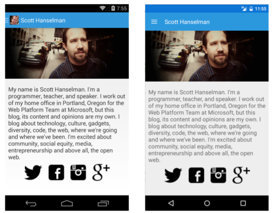
Here is the final result of just a few minutes of work in my Hansleman.Forms app:

Nice new styling for the colors, larger action bar, better fonts, and of course a nice new hamburger button! So can you get Material Design in your Xamarin.Forms application? Absolutely, but you just don’t get everything and it is for a limited amount of users. However, the number of Lollipop users is only going up so why not add a bit of flare to your app?


