Twitter recently launched Twitter Lite a stripped down “faster” and more “data friendly” version of their mobile app and refresh to their mobile website. It is more than just a new mobile website, it really is a Progressive Web App (PWA) that offers up notifications, camera integration, and some of the common features of twitter such as timelines, tweeting, and direct messages. It also benefits from being really small, under 1MB to use with nothing to install, and has a really cool feature called Data Saver that wont auto download images or videos in your timeline. This is a nice touch that should just be a standard feature of the Twitter client. You are probably saying wow!, all of that from a PWA, does this mean that is the future? Well no, let’s actually break down the app itself.
The Audience for Twitter Lite
The idea behind Twitter Lite or any other “Lite” application out there (Skype, Facebook, etc), is that it is an extremely small application for emerging markets where internet is hard to come by. The “Lite” apps aren’t really for the average consumer as they have plenty of space on their phones/tablets and WiFi/LTE usually isn’t a huge concern. While Skype and Facebook, from what I can tell, just produce stripped down native apps that are region locked on the app stores, what Twitter did was create an actual PWA that technically anyone could get by going to the mobile site and pinning it to their home screen. So looking at it from the prospective that I am not the target customer for this PWA, but I am developer who is interested in technology, how does it compare on both iOS and Android?

Performance / Nativish UI
So, first off when I go to mobile.twitter.com on my iOS 10.3 device I just got a blank screen until I cleared the cache, which was not a good start (also I had to delete the twitter app from my device to even get it to work, but YMMV). Now I know technically PWAs aren’t an iOS thing since a lot of the features aren’t in Safari yet or whatever, even though you have been able to pin apps for a long time.
On Android, it was pretty seamless and I actually have the PWA side by side with the main Twitter client.
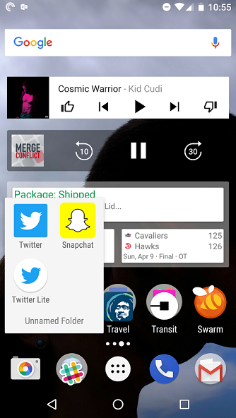
There it is! It is in a folder, not in the app drawer as it isn’t an app and can’t be placed there. This means if I delete the icon on the launcher the PWA is gone! There are some good things here the PWA does, such as have a splash screen, it runs in full screen, and a few native features that I will talk about in a bit. You can tell though that it doesn’t really have full control over this experience. The splash screen for instance is dull and takes a few seconds to load on my 6P:
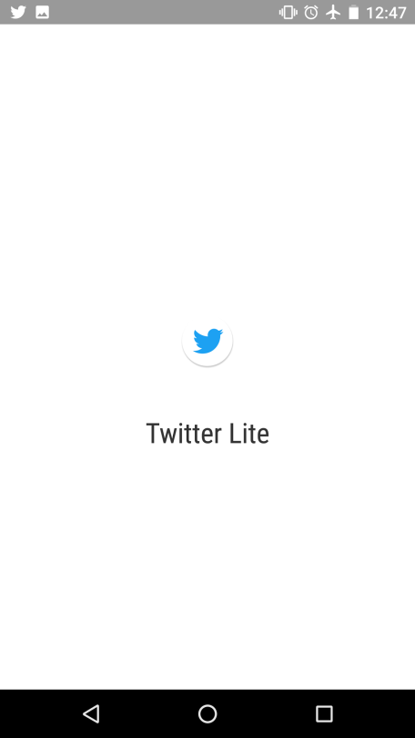
Once loaded though we get an interesting look of an app… kind of app, but not really like an Android app, some similarities, but a bit different.

Additionally, it looks 100% exactly the same on iOS with the material design look, which is odd for any iOS user if it is supposed to be app like.
A few issues first arise with the “app”, which is that you can’t fling through the tabs like a native app, there are no animations at all for the floating action button, the scrolling performance itself is a bit laughable as there is often blank space or pop in of full tweets. There is no flyout navigation at all and you have to know to tap on your profile picture to display a very odd settings menu that is embedded into whatever tab you happen to be on (and the FAB sits on top of it). Fonts are off and strange and like a lot of the “web/react” apps out there the toolbar is just a hot-mess with improper fonts, sizing, and height. Additionally, we see some lacking functionality from simple screens such as the profile edit.
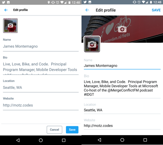
Profile Screen - (Twitter Lite on Left, and Twitter App on Right)
The fact that the ENTIRE window scrolls up and down really shows just how much it is actually just a full screen window running in Chrome. If that wasn’t bad enough, each and every page you open gets added on to the navigation stack (like a website), this adds to frustration when navigating around. My favorite bit of performance has to be the toggle switch to turn on and off features, which lags by about 3 seconds after touching to change the toggle, “fast”.
Native Capabilities
One thing that PWAs talk about is that they have access to some native capabilities. There seems to be some differences here between each operating system and browser of the operating system. For instance on iOS you can take a photo or pick a photo when tweeting, but on Android you can only take a photo. With “push notifications” this seems to also only be on Android, with no options at all on iOS. It is clear though that it is very limited, just by drafting a new tweet:
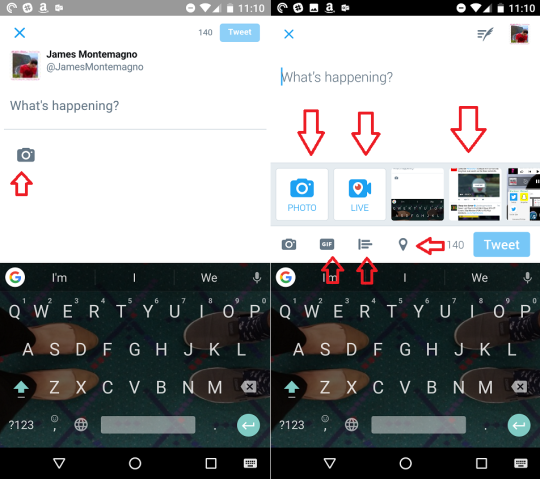
New Tweet (Twitter Lite on Left, Twitter App on Right)
What we notice is that poor Twitter Lite has a single button and a weird layout to send a tweet (that tiny tweet button up there is weird!!!!). Over on the main app, it is tying into my recent screen shots, I can take a photo, add location, add a gif, and has a proper sized tweet button.
Notifications
I will say that this is kind of cool that on Android PWAs you can receive push notifications. I have all of mine turned off on Twitter, but I decided to test it out. Remember that Twitter Lite is NOT an app, it is running in Chrome in a special mode. This means that when the push notification comes in, which it does fast, there is some interesting things that happen:
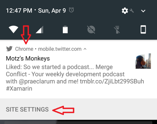
We clearly see that a website (mobile.twitter.com) sent us the push notification and that it actually came from Chrome. Odd, but even more interesting is there is a lack of functionality here in the push notification as there is no place to reply at all and there is this weird “Site Settings”. When I actually clicked on that it launched Chrome and crashed the Twitter Lite PWA and Chrome itself on Android. I had to go in and force quit Chrome to get the Twitter Lite app to restart, which was a fun adventure after using the app for only a few minutes.
Camera + Permissions
I mentioned that on both clients, you could take a photo with your tweet. This is nice and websites also have this capability to a certain extent based on the browser, but on iOS and Android there are strict restrictions on permissions. This means when you actually go to take a photo, you are prompted for permission from CHROME, not Twitter Lite:
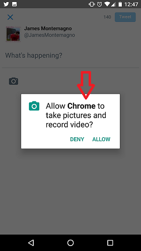
This seems sort of like a weird security gap with PWAs as now any site/PWA would have this permission allowed if I let it and also is pretty confusing for a user.
Offline Mode
A huge advantage of native applications is that you truely have full access to the entire operating system and every API. This means you can craft lovely online and offline experiences, deep integrations with databases, realtime notifications, etc, you get it. So what happens when you go into airplane mode and launch Twitter Lite:
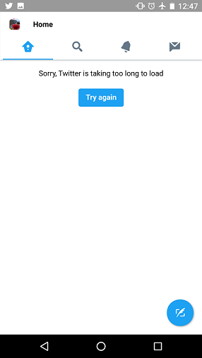
That is right… you get a shell of an app with nothing cached and no way to do anything. It doesn’t tell me I am offline for some reason, which is a bit odd. On the Twitter client I get to browse all of my past cached content, with pretty smooth scrolling. Now, reading the PWA site it says this should be capable of caching for offline, but maybe Twitter didn’t take this into consideration even though the app itself was made for users with extremely poor to no internet connection…. just saying.
Wrapping Up
At this point you are probably saying, wow… James must really hate Twitter Lite and PWAs. I wouldn’t say that at all, I think that Twitter Lite is an interesting step to build apps for emerging markets, but I think it just fails on a lot of things that could be part of the main Twitter application that everyone could benefit from. Additionally, I feel as though Twitter could have made some really stripped down native apps that focus on less features instead of trying to do everything with a PWA and updated mobile site (although I will say it is better than before). So, what does this mean for mobile apps? As I have said for the past 6 years, native apps are kings and queens with full access to native APIs, performance, and user interfaces and is how I recommend building applications. If you are building apps with native language or native with Xamarin this is what you can deliver to your users in the app store. Are PWAs a waste of time? I don’t think so if you have the development resources to dedicate on them and offer a richer experience to users that won't install your app. The win here for Twitter is to bring more people to Twitter that may just be browsing on the mobile site instead of installing the full app. They can get them to pin Twitter Lite and once users want the full experience they move to the native client. That does seem like a good strategy to me.


