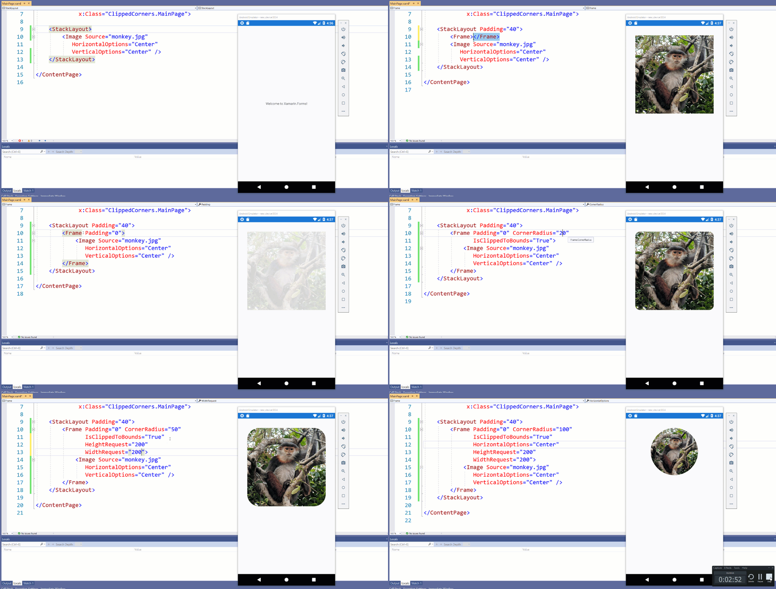
I love watching trends in mobile design. Currently gradients are all the rage, but two trends that have been around for a while are rounded corners and circular images. A long time ago I created the Circle Image plugin for Xamarin.Forms that many developers know and love, but did you know that you can just use built in controls to get a circle or rounded corners? All you have to do is use a frame and set a few special properties!
Let's start slow and just put a beautiful Red-shanked Douc Langur on our Page:
<StackLayout Padding="40">
    <Image Source="monkey.jpg"
       HorizontalOptions="Center"
       VerticalOptions="Center" />
</StackLayout>
Now let's wrap this cutie in a Frame ensuring we set the Padding to 0, as it defaults to a large number, and the CornerRadius to what we would like:
<StackLayout Padding="40">
    <Frame CornerRadius="20"
           Padding="0">
        <Image Source="monkey.jpg"
           HorizontalOptions="Center"
           VerticalOptions="Center" />
    </Frame>
</StackLayout>
Wait a second... where are our rounded corners? Well this is because we need to set the IsClippedToBounds property to ensure that the image gets clipped correctly:
<StackLayout Padding="40">
    <Frame CornerRadius="20"
           Padding="0"
           IsClippedToBounds="True">
        <Image Source="monkey.jpg"
           HorizontalOptions="Center"
           VerticalOptions="Center" />
    </Frame>
</StackLayout>
Circular Images with Frame
One of my favorite features of Frame is that if you set the Width and Height you can create a circle image by setting the CornerRadius to half of the Width/Height:
<StackLayout Padding="40">
    <Frame CornerRadius="100"
           HeightRequest="200"
           WidthRequest="200"
           HorizontalOptions="Center"
           Padding="0"
           IsClippedToBounds="True">
        <Image Source="monkey.jpg"
           HorizontalOptions="Center"
           VerticalOptions="Center" />
    </Frame>
</StackLayout>
Here it is using XAML Hot Reload 🔥🔁

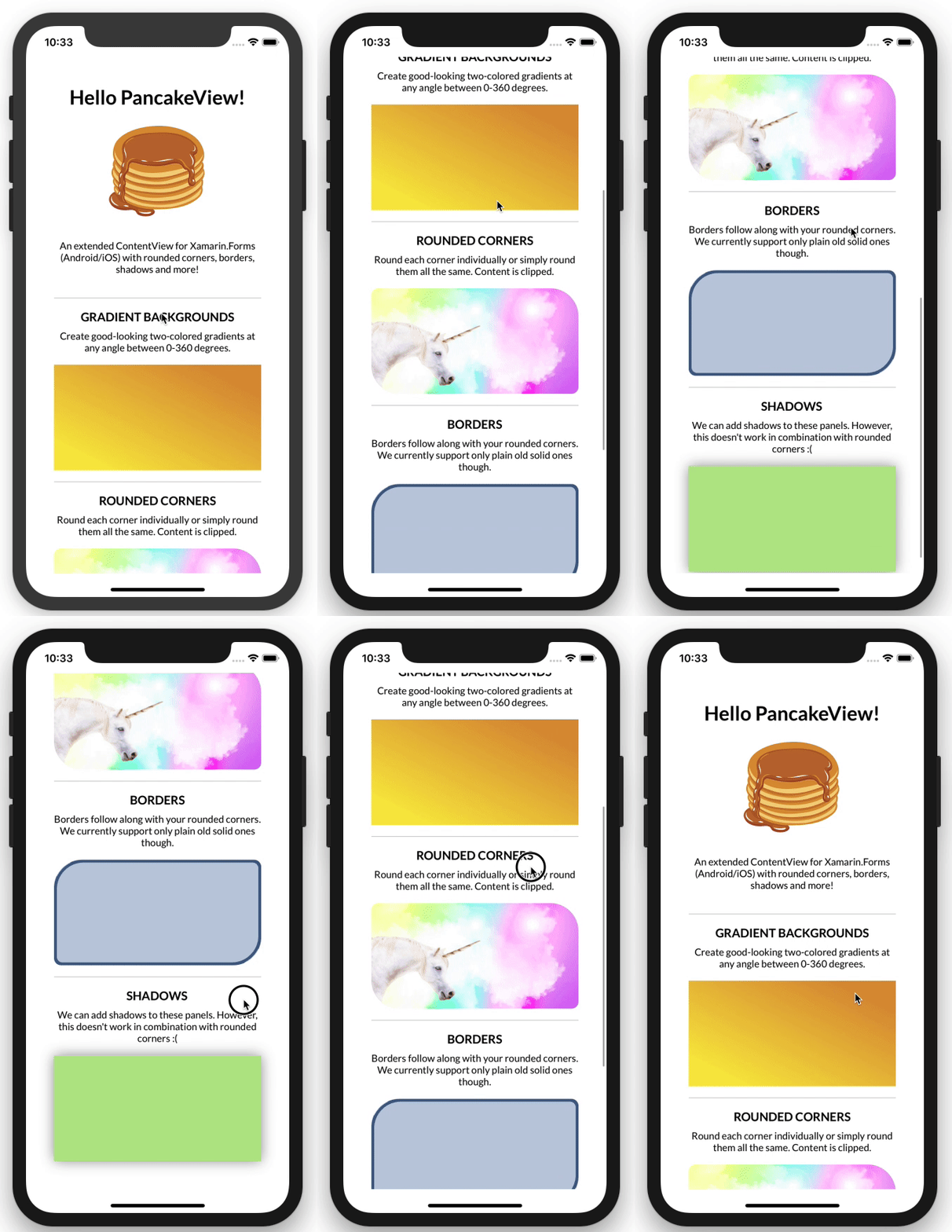
This approach is also works if you are using the incredible PancakeView control that also supports gradients!

Xamarin.Forms 5
If you have upgraded to Xamarin.Forms 5 then you can optionally use the brand new Shapes API. Everything view can be "Clipped". It is one of my new favorite features, and I use it all the time because it doesn't introduce a new view to the heirarcy.
<StackLayout Padding="40">
    <Image Source="monkey.jpg"
       WidthRequest="100"
       HeightRequest="100"
       HorizontalOptions="Center"
       VerticalOptions="Center">
        <Image.Clip>
            <EllipseGeometry
                Center="50,50"
                RadiusX="50"
                RadiusY="50"/>
        </Image.Clip>
    </Image>
</StackLayout>
This will give you the same exact effect :)


