Last week I wrote about my new quest to fully optimize and enhance Hanselman.Forms. This involves using the latest and greatest in Xamarin.Forms and Xamarin.Essentials, but it also means spicing up the app with some lovely visuals and design. My first quest was to re-design the podcast section of the mobile app to create a list in grid form of different podcast that Hanselman produces.
So, first things first we should design a card to hold each podcast in. This can be accomplished with a simple Frame with a drop shadow on it:
<Frame
    Padding="0"
    VerticalOptions="Start"
    HasShadow="True">
    <Grid Padding="0">
        <Grid.RowDefinitions>
            <RowDefinition Height="Auto"/>
            <RowDefinition Height="Auto"/>
        </Grid.RowDefinitions>
        <Image Source="{Binding Art}" Aspect="AspectFill"/>
        <Label Grid.Row="1" Margin="10,0" Text="{Binding Title}"/>
    </Grid>
</Frame>
This simple code results in a pretty nice look for album artwork:
I will absolutely want to try out the new Visual Frame/CardView enhancements now that Xamarin.Forms 3.6 is out to make sure it also looks great on iOS.
Wrapping Podcasts
Wrapping the multiple podcasts into columns and rows dymanically would be pretty ideal for something like a CollectionView, but it is still in preview. I thought instead that the the FlexLayout would be a great option because it can arrange its children horizontally and vertically in a stack in addition to wrapping items. Here is one of the samples from the documentation:
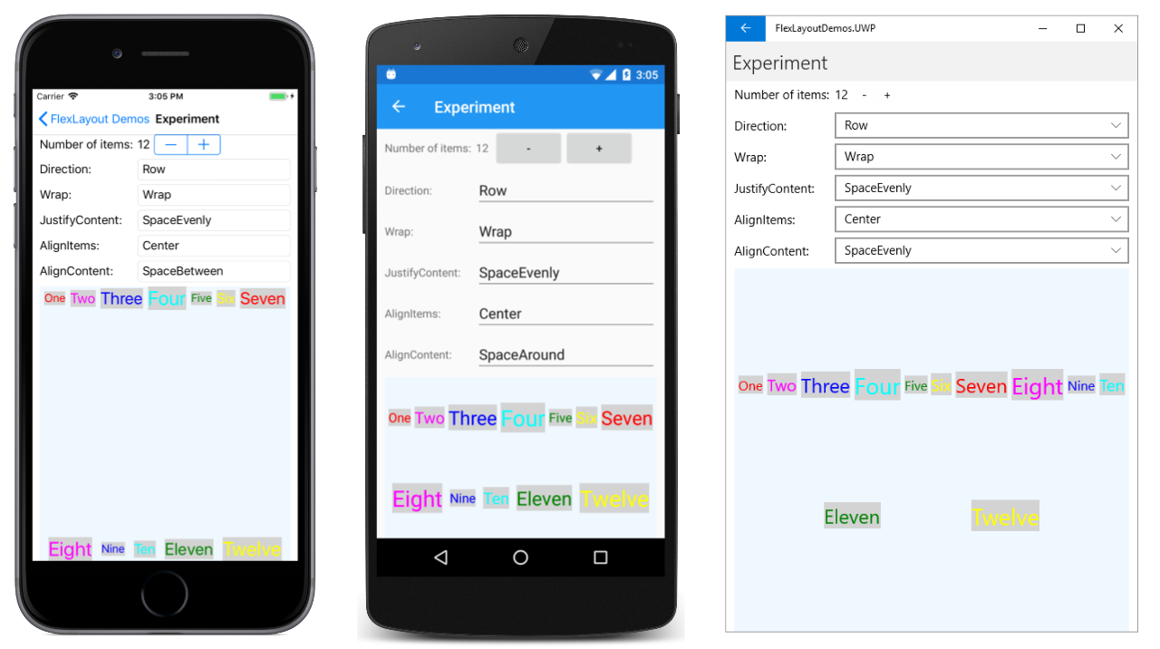
Taking this concept I was able to combine the FlexLayout with a BindableLayout to make something pretty spectacular:
 <ScrollView>
    <FlexLayout BindableLayout.ItemsSource="{Binding Podcasts}"
           Wrap="Wrap"
           Direction="Row"
           JustifyContent="Start"
           AlignItems="Start"
           AlignContent="Start"
           Padding="8">
        <BindableLayout.ItemTemplate>
            <DataTemplate>
                <Grid Margin="4,4,4,4"
                      FlexLayout.Basis="{OnIdiom Phone='50%', Tablet='33%'}"
                      FlexLayout.AlignSelf="Start">

                   <local:PodcastCardView />

                </Grid>
            </DataTemplate>
        </BindableLayout.ItemTemplate>
    </FlexLayout>
</ScrollView>
It tooke me a long time how to figure out how to space each of the cards correctly and wrap to the next line while still starting on the left hand side. This was accomplished by setting all of the Align properties to Start as well as the JustifyContent. It resulted in a really great Android version:
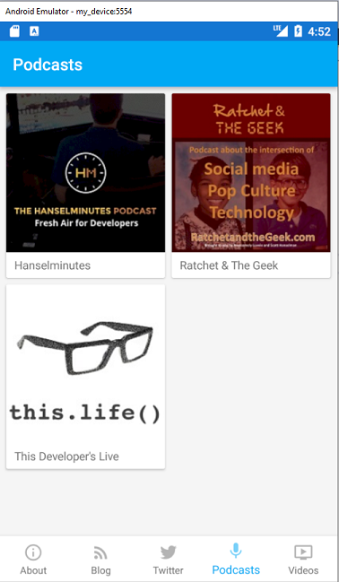
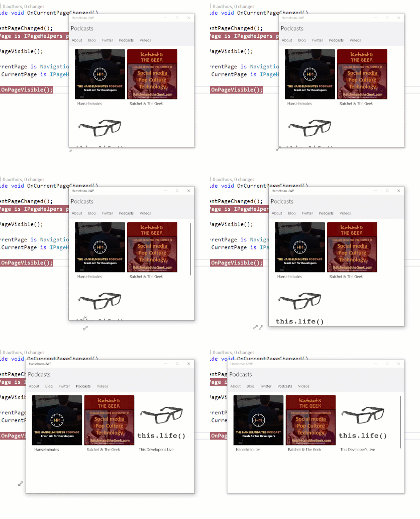
Better yet, when I ran it on UWP or changed the orientation the FlexLayout reacted very nicely:
Seeing this in action I was very content and wrapped up a great week 2 of live streaming updating the app on Twitch.
You can check out the full pull request on GitHub to see how I setup a full mock data source, handled tab transitions, and the final implementation for FlexLayout in the app. Don't forget that I am accepting pull requests and feature requests too on the official GitHub page.
My final take away thoughts are that while the FlexLayout is relatively complicated and has tons of little settings to tweak, it is still extremely powerful and worth dedicating some time to.
