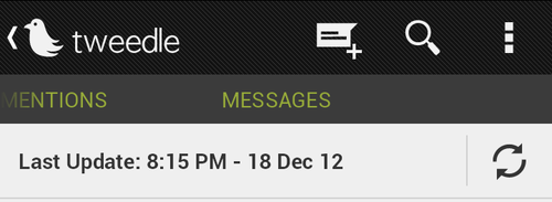
If you don’t know about Tweedle and you are on Twitter and Android you should probably download it. It is a fantastic twitter client with focus on core Android design which is clean and beautiful. It is also developer by an awesome developer, Mr. Daniel Huckaby.
I have been using it nearly since day one and he keeps updating it with great features and enhancements. A while ago he revamped the direct messages part of the app and instead of a pull down to refresh like mentions and timeline had he implemented a simple “refresh” button but also added in the time and date.

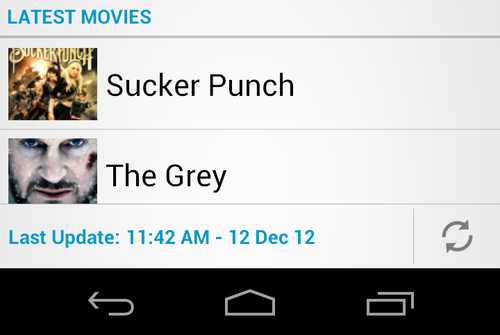
I am not sure exactly why he went down this route, but i really like it. So I wanted to implement something similar in the Ceton Companion App, and while I am not a fan of Relative Layouts at all which I am sure is what he is using as it is very beneficial I love to use LinearLayouts, just because I can think them up in my head easier. However I found it easier to use a combination of Linear Layouts and also TableLayouts. I also wanted mine on the bottom of my list view compared to at the top like in Tweedle. So here was the code:
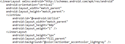
First I started with a standard LinearLayout with orientation of vertical. Inside there I added in my ListView which would fill up everything with layout_weight=“1”. Then you will see I add in a single LinearLayout with 1px. This gives it a nice separator line. I haven’t found a control to do it better just yet.<

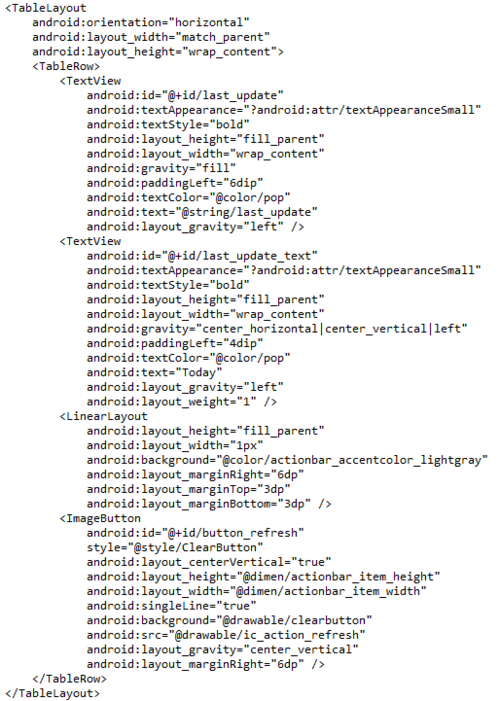
Next up is the real meat of it. Basically you have a single row, but with 4 columns. First is the text “Last Update”, second is the actual date/time tamp you want to use, followed by the 1px seperator, and finally by actual refresh button. Now this refresh button is a standard ImageButton that has no background and you will need to do some custom stuff there with the size, but overall you should be able to figure it out.

So this is probably not the best way to do it, but I will say I think it looks fantastic:


