




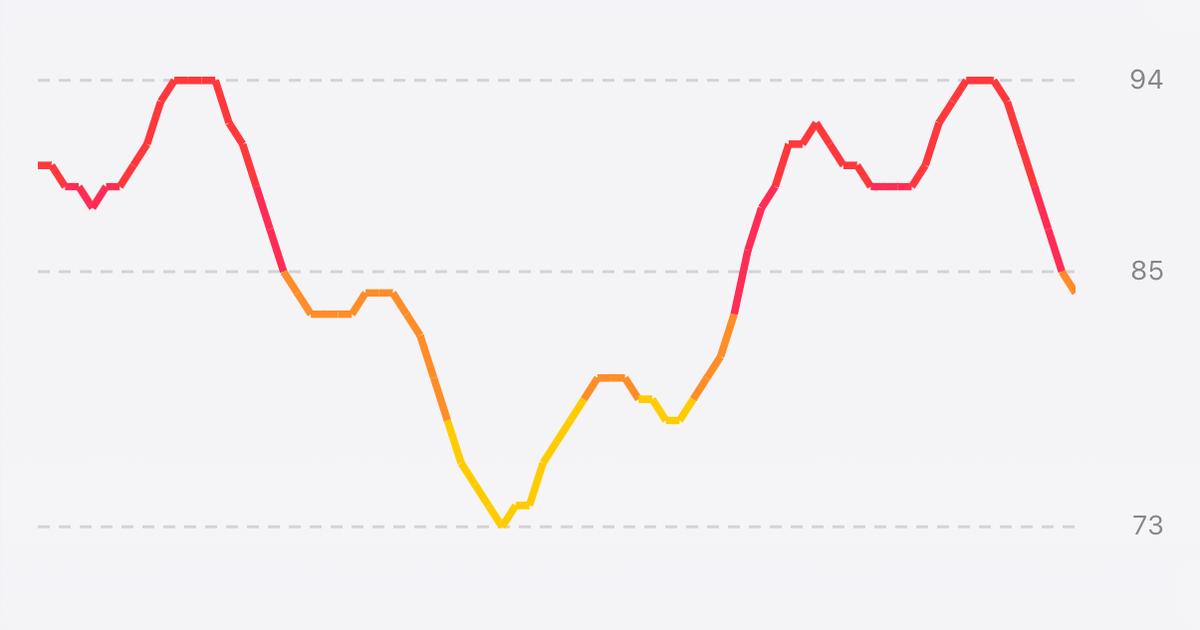
The new live cadence chart, cropped from the real app on the iPhone Duo simulator during a simulated ride.
My Cadence has one job: put a big number on your screen so you can see your RPM while you're on the bike. I built it back in 2020 because Apple Fitness+ wouldn't connect to my cadence sensor, and it has become one of my top apps. These days it's a Swift app on iOS and a .NET MAUI app on Android.
I wanted My Cadence to look and feel great on iPhone Duo. Here is what a ride looked like on the Duo's big inner display before this work:
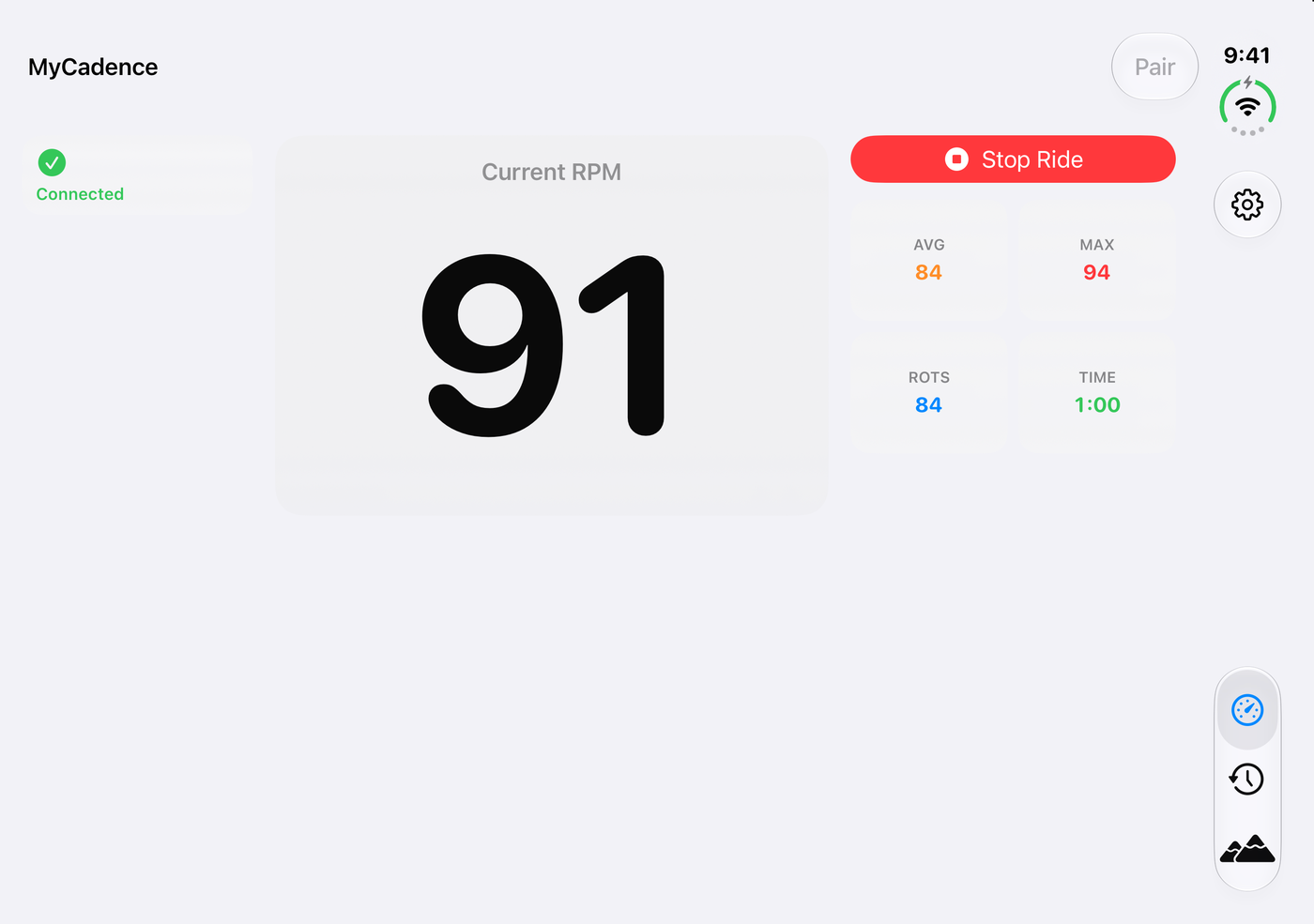
It works, but that is a whole lot of empty space! So how do you use all that room without ruining a simple app?
One thing up front: I don't have an iPhone Duo. Everything here was tested on the simulator, and this update isn't in the App Store yet. So, let's walk through the plan, the skills, the design, and the gotchas.
Start with a plan, then find a better one
I started with a written plan, and my first version was ambitious: a new "cockpit" look on every iPhone, built on top of a community toolkit. Then I brought in Apple's iPhone Duo preparation guide, and it changed the whole thing. Apple breaks the work into three steps:
- Run the App Resizability skill to scan your project.
- Fix what it finds, and inspect what automation misses.
- Test resizing on the simulators and tools Apple provides.
One line from that guide really stuck with me: "On the inner display, your app should look like a natural extension of its iPad layout." Keep that one in mind, because it pays off later!
Sticking with Apple's tools
Apple's App Resizability skill comes with Xcode. You can ask Xcode's coding assistant to "get my app ready for iPhone Duo," or export the skill if you use a different agent. I exported it and ran everything from VS Code with GitHub Copilot.
My first plan also pulled in Duology, a community set of skills and a fold linter for iPhone Duo. Once we had Apple's official tooling, I asked whether we still needed any of it, and I decided to stick with Apple's tools only. The most useful part for My Cadence was the checklist, and fewer moving parts felt right for a simple app. If you're building something new for Duo, it's still worth a look.
So what did the audit find? Honestly, not much! My Cadence wasn't sizing itself from the main screen, checking for specific devices, or making layout choices from device orientation. It did turn up the Ride and Scenic player screens choosing their layout by comparing width and height, plus catalog thumbnails that could widen their grid column.
A clean audit isn't the finish line, though. Apple says so in the guide: "The skill finds most issues, but not all of them." Most of the problems in the rest of this post came from reading Apple's docs closely and from actually running the app.
"We don't need crazy colors"
While I was working on the plan, I started thinking about new ideas for what the app could do with all that extra screen. It's hard to picture a layout from a table in a Markdown file, so I asked GitHub Copilot in VS Code to generate some image mockups for me. Here is what came back:
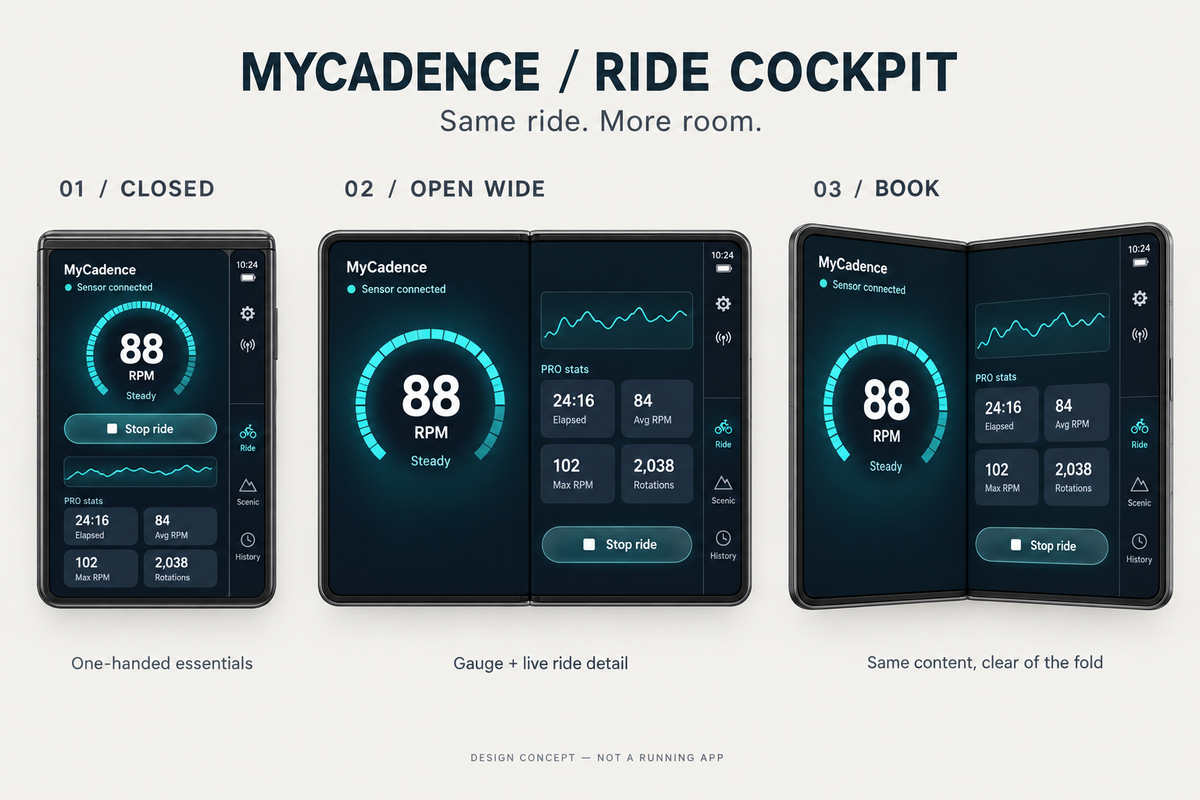
Pretty wild, right? It's a full "Ride Cockpit" concept, with dark teal screens and a glowing gauge wrapped around the RPM on the closed, open, and book-style Duo. It even came with a tagline: "Same ride. More room."
It's cool, but it isn't My Cadence. The whole point of the app is a big, simple number that you can read while you're riding, and it's supposed to feel like it belongs on your iPhone. So, here is what I said back: "We absolutely want to keep with our very simple design that we have today in the app, we don't need crazy colors or anything like that, we want just super native look and feel for light and dark mode."
Copilot updated the plan and generated a new set of mockups in both light and dark mode. This round looked a lot more like the app I know:
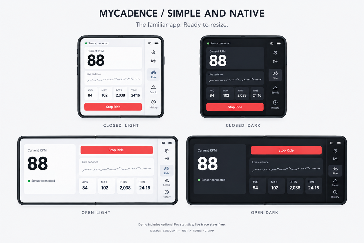
There's the big number, the familiar cards, and a regular Stop Ride button, plus a small, quiet line for live cadence. That became the rule for the project: same app, more room. There are no gauges, gradients, or new color themes, and my existing Pro customizations keep working.
Asking for pictures this early was so useful. No app code had changed yet, so it was really cheap to look at an idea, say "nope," and try again. It's a lot easier to react to an image than to a paragraph describing one!
One thing to be aware of: generated mockups can make things up. These drew approximate system controls and even little camera icons, and that doesn't mean I wanted any of that in the app. I used them to pick a direction, not as a spec. The actual layouts came from Apple's guidance and from running the real app.
"Something much more interesting"
The first working version kept everything simple and added a small gray cadence line. It worked, but with the Duo open I wanted more from all that space. My feedback was that it needed "something much more interesting," like a live chart right alongside the stats.
So now it has one:
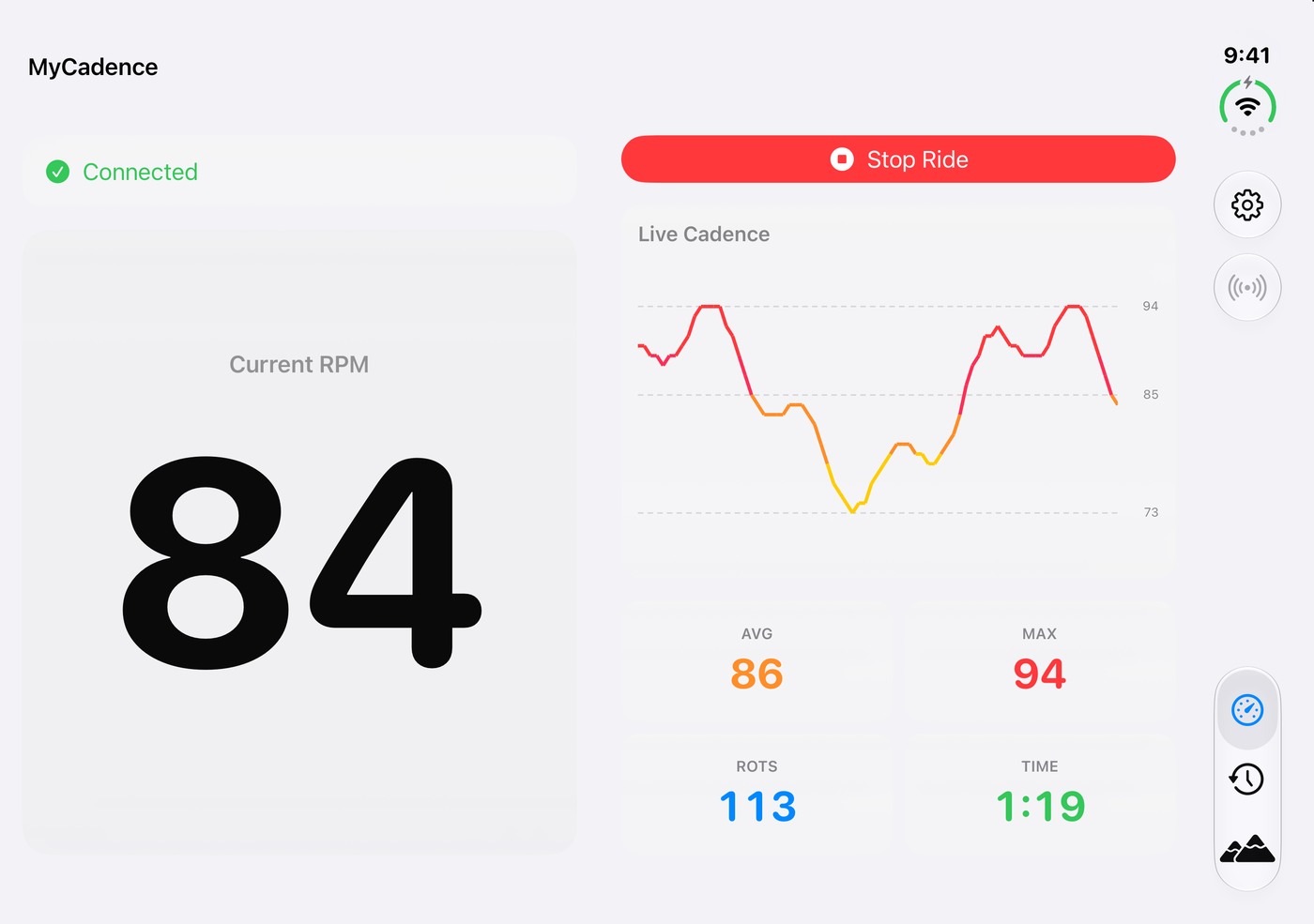
The big chart is the same chart and colors you already see in ride details, and it's free for everyone. The number and stat tiles get bigger too.
Here's the nice side effect: the iPad gets this layout too! I have a lot of iPad users, and they had the same empty screen.
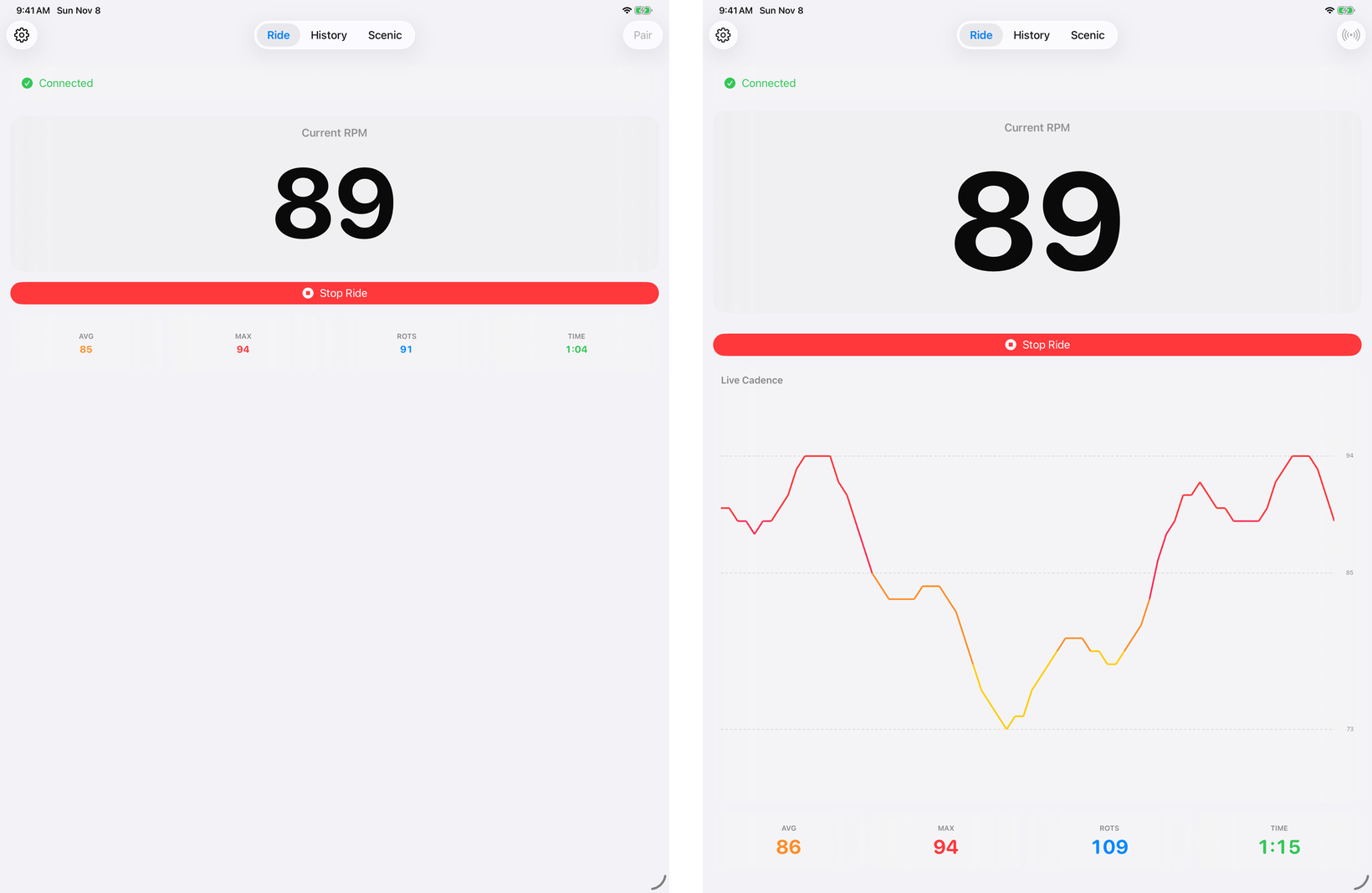
What about a regular iPhone? It keeps what already worked: the full-size number and the stats, with a small trace added.
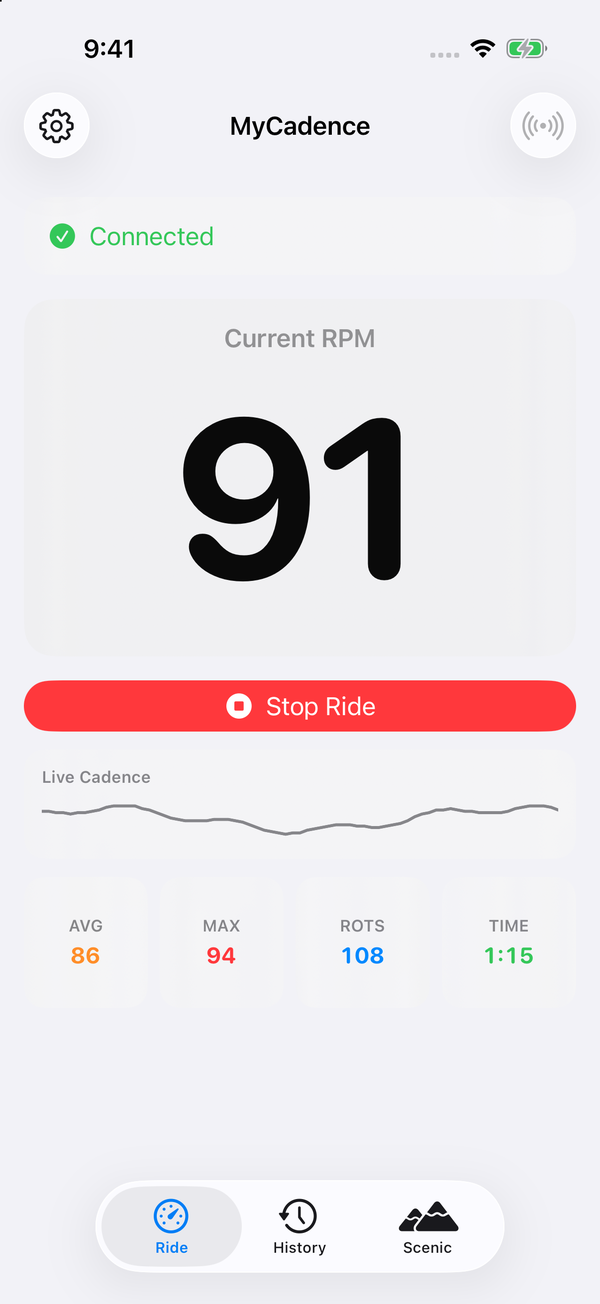
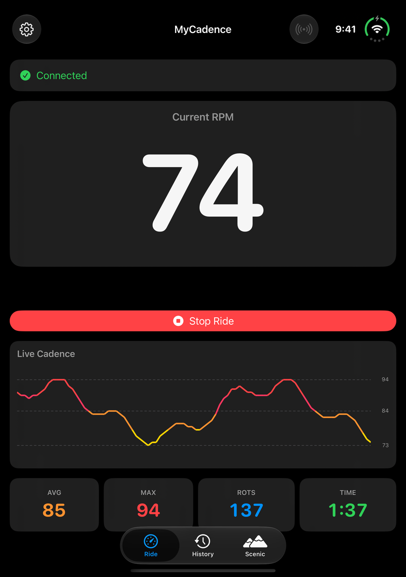
Light and dark mode come straight from the system, just like they always have:
The gotchas
Apple's split container would have hidden the controls
The plan was to use Apple's native layouts first, and for Ride and the Scenic player that meant ArrangementView. Then we read the split style documentation closely: "When someone is holding a closed iPhone Duo in landscape orientation, the split arrangement only shows the primary view."
For My Cadence, that means you'd lose either the number or Start/Stop and your stats. That isn't okay on a bike! We're going by Apple's docs here, since I didn't see that pose for myself before making the call. So we wrote a small layout of our own for those two screens, and History still uses Apple's native split view.
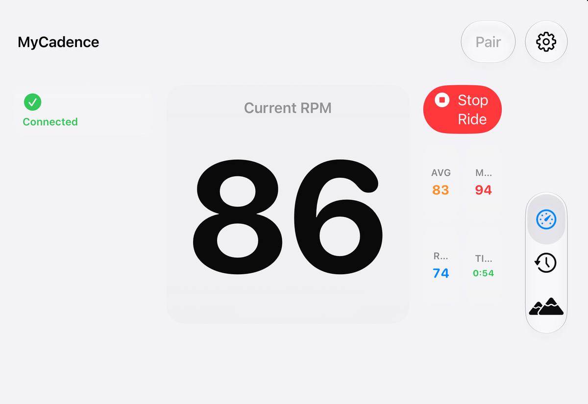
The closed display in landscape needed the help. Here is the old layout, with its cut-off stat labels and a wrapped Stop Ride button:
And here is the new one, with everything still on screen:
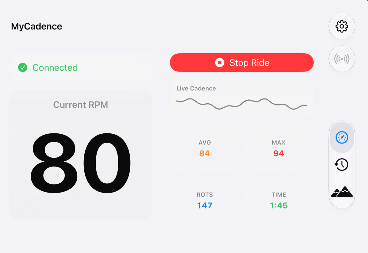
My takeaway: go native first, right up until native hides something people need.
The number that got cut off
In an app about one big number, this one hurt. The first pass cut off the RPM on the closed display in portrait. Copilot noticed and made a quick fix at the end of its run, but that fix only stopped the clipping by making the number noticeably smaller.
When I looked at it, I said it should be "more like we have today." The next pass gave the number more of the screen, and it's back to full size:
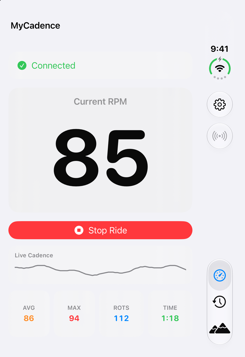
A layout can pass every check and still be wrong for your app. You have to look at it!
Your video might not survive a fold
My Cadence has Scenic rides, which are first-person cycling videos you can ride along with. There were two problems here. The player compared its address against one that always differed, so any view update could reload the video. The screen also swapped between two different layouts, and that destroyed the player whenever it changed.
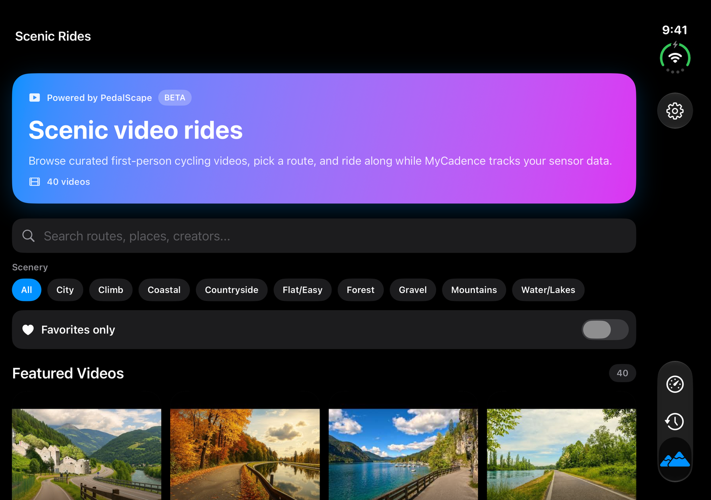
Now there's one stable player. On the simulator, the video kept playing through a fold, moving from its intro into the ride footage with no new page load. If your app embeds a web player, go test this one! The catalog also uses the room a lot better now, with four columns when the Duo is open instead of one giant card:
The little ones
A few smaller bugs showed up once we started really testing:
- A missing Back button. A collapsed History detail had no way back, so selecting a ride with the phone open and then closing it left you stuck. Test that exact path if you use a split view!
- Ride charts that stopped short. They had a fixed height, so on a big iPad the chart stopped about halfway down the screen. Now they grow to fill the space.
- "1 rides" and "12 / 1 rides." Yes, really. It had nothing to do with Duo, but my achievements screen now reads "1 ride" and "12 rides."
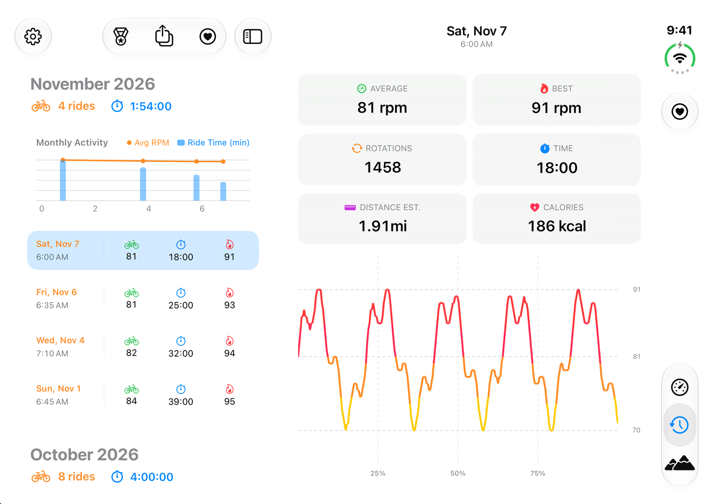
Here is where History ended up, with the list and details side by side when the Duo is open:
Testing without a Duo
Step three of Apple's guide is testing, and the iPhone Duo simulator is Apple's recommended way to test the full experience. One thing to be aware of: you change poses with the Closed, Partially Open, Open, and Rotate controls in Device Hub. Those controls are the only way to do it, so testing takes a while. My Mac even locked in the middle of one run, and that was the end of folding until I got back to it!
The simulator also has no Bluetooth, so we added a debug-only simulated cadence to ride with. With that, one ride kept going from open wide, through book, to open tall.
Wrapping up
If you're getting your own app ready, start with Apple's guide and treat the skill as a great checklist. Then put the app on the simulator and look at it, because the things that mattered most for My Cadence came from looking at it. And don't be surprised if your iPad app gets better along the way.
The update isn't in the App Store yet, but you can check out My Cadence today. It's the same simple app with a whole lot more on screen. Happy riding!